It’s easy to give a watch a little PVD. Physical Vapour Deposition – a means by which, using argon and some high voltage, a coating can be applied to metal – is a relatively uncomplicated way to give a watch additional durability, but also, if you want it, some colour. “But the important thing is that it’s still a surface treatment – and if it gets scratched deeply enough you have to re-surface and re-coat,” says Tim Malachard, the global marketing director for Richard Mille. “The difference is that now we can get colour integrated into some materials. And that means you can wear the watch daily. You don’t have this idea that a high-end watch has to be treated carefully.”
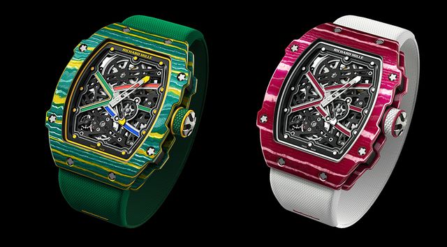
Indeed, Richard Mille may be known for, among other things, its use of colour, but of late it’s gone to town: watches in the colours of the Spanish and German national flags, for example, or in that very particular signature hue of orange for a watch it’s made in collaboration with carmaker McLaren. And it’s down to Richard Mille’s exclusive partnership with Swiss material technologies company NTPT – some 18 months ago it worked out how to use quartz to give colour to carbon, typically black as it is.
“Basically they use layers of quartz and carbon in the right ratios to get the right colour – you increase or decrease the carbon content to get the right Pantone number,” explains Malachard, helpfully simplifying what is actually a seriously complex process. “But carbon quartz is also still very light and hard and we can machine it. When they suggested colours would be possible we knew it was right for us – we’re a fun brand. But we still had concerns about quality, durability and longevity before we conducted all the necessary tests.”
That high-end watch makers are embracing colour – and not just in dials, but in bezels and in cases – is clear. The usual sea of shiny steel and shades of gold is slowly giving way to bolder hues – much as historically-sober menswear has embraced colour, or the way in which the age-old best-selling colours in cars, black and silver, have in recent years had their position wobbled by lustrous browns, bright greens, blues and pinks. “Go up and down McLaren’s production line and it’s all wacky colours,” says Malachard. “People are generally getting more creative in the use of colour in their lifestyles”.
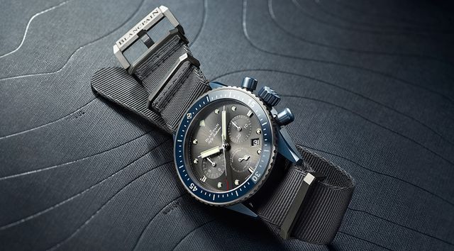
There remain restraints. Consumers may be getting beyond their chromophobia – the irrational fear of colour – and ceasing to associate sophistication with the merely monochrome. Yet, given that most consumers want their one high-end watch to last a lifetime, while they might be comfortable with more ‘natural’ shades of green, brown or grey – the kind of shades offered by the likes of Omega and Blancpain over recent years – how about sunflower, or cerise? And, thanks to the Swatch brand introducing colour, arguably we’re still getting over the long-term association of colour in watches with cheap, disposable plastic. Most consumers have yet to make a connection between colour and a noble material. But that is changing fast.
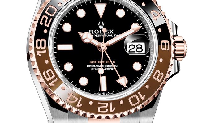
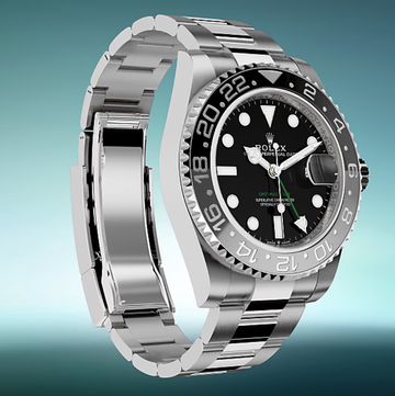
Indeed, the watch world’s interest in colour stems from more than a superficial desire to extend the spectrum of possibilities, or the possibilities of the spectrum. It’s about the deep knowledge of how to make any colour work with the more advanced materials – sapphire, ceramic and the like – that to date have proven resistant. It’s, as Rolex found when developing the two-tone brown/black dial of its latest GMT, the problem of how to get two different colours to sit perfectly neatly alongside each other in the same piece of ceramic.
This was overcome, in a world first, by making use of ceramic’s state after the removal of binding agents: at this point it’s highly absorbent, allowing certain colour-specific compounds dissolved in a solution to be introduced into selected areas, compounds which during the 1400 degree sintering process react with the ceramic to cause the colour of said areas to change.
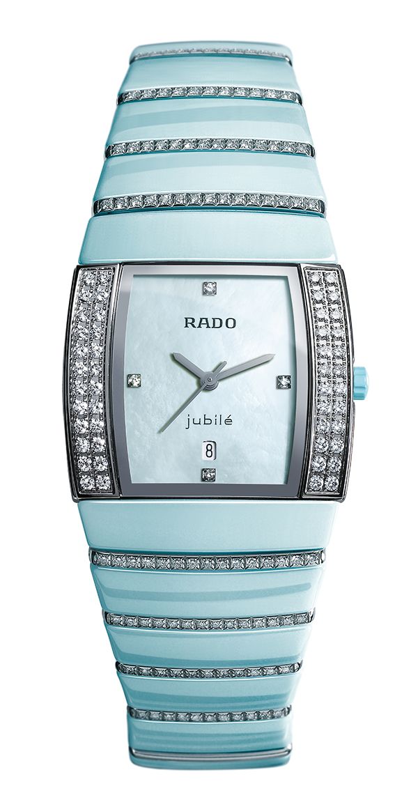
Wind back a few years to the early efforts made by Rado, for example – a pioneer in the use of ceramics in watchmaking and latterly in coloured ceramics. Perhaps a little too pioneering in fact. “When we first launched a rose and a light blue ceramic, in 2006, the market just wasn’t ready for it,” concedes Matthias Breschan, Rado’s CEO. “It took a few years for the idea of colour to be accepted and for us to get the younger clientele that’s more interested in colour. But while the market was less inclined to colour, it seemed, the fact was that there were technical limits as to how to making colour work anyway. Getting ceramic to take a colour is extremely challenging.”
In a nutshell – again, for those without chemistry degrees – it involves adding pigment to a (typically) zirconium dioxide-based material. But there remain severe restraints as to which pigments can be used – some won’t take the sintering that gives ceramic its sheen and hardness; some undermine the structure of the base material, making it less shock or scratch-resistant – which has kickstarted experimentation with other options, like transparent aluminium. Some pigments turn out to be toxic or non-hypoallergenic, forcing you have to work with high quality ceramic to hold the colour. Much as cheap ceramic goes yellow after prolonged exposure to UV light, colour in it fades fast too.
“So, yes, your options are limited,” says Breschan, who has used coloured ceramic with Rado’s more directional True Thin, Hypochome and Ceramica models. “And then of course there’s the matter of consistency. Working with less stable coloured ceramic is fine if you’re making a super-limited edition. But when you’re making several thousand pieces in each colour, you need the shade to be exactly the same from piece to piece. And within the piece too – you’d see even the slightest variation in colour between the links of a bracelet, for example. It’s never complicated to make coloured ceramic for a few pieces. It’s scaling it up to industrial levels that’s the problem. The investment to make it possible is worthwhile though – it allows our brand to stand out. Colour allows you to transfer a technological statement to something emotional, and emotions are really what the watch industry is about.”
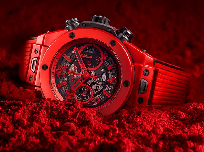
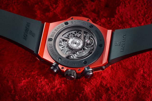
Perhaps this is why Hublot made a point of launching its Big Bang Unico Red Magic this spring in a vibrant red ceramic – reds and oranges being particularly awkward when it comes to toxicity issues, hence their rarity. Just ask Francois Nunez, now creative director at HYT (whose watches use vibrant liquid colour in their displays) and formerly product director at Victorinox. He spent two years trying to match the knife company’s signature shade in a watch. “It was hard work and took infinite testing, but worked out well in the end – when I left the job!” he laughs.
It’s not just about beating a challenge: there are real commercial incentives, too. “When you can use colour to come up with a unique watch – and now we can colour any part of a watch, or the whole watch if we want – and when you’re the only one able to do it, that’s an advantage in a market in which people are looking for difference,” argues Ricardo Guadalupe, Hublot’s CEO. “It’s why the likes of Hublot have to keep pushing on innovation – because other brands will work out how to do what you’re doing.”
Naturally then, Guadalupe isn’t saying exactly how it’s done, other than it involved four years of experimentation to find the tricky recipe of carefully balanced materials, heat and pressure – which allows the ceramic to be sintered without burning the pigments – and that it allows every component in the watch to be made from the resulting “special material”. This special material, the company claims, also happens to be harder than conventional ceramic – but that’s just a bonus: having mastered the basic colours, Hublot is now planning to follow up this red with a riot of colour. It’s not stopping with ceramic either. Last year blue and red sapphires were achieved by fusing them with metals – iron and aluminium oxide or chromium respectively – circumventing sapphire’s unstable crystallisation process and avoiding the bubbles and cracks that typically appear in the material too, especially when big enough sapphires are produced.
“The fact is that you need to invest a lot in R&D to find the right processes and the right components – and that can push the prices of the resulting pieces up,” Guadalupe explains. “Colouring sapphire – achieving those blues, pinks and reds – was an even bigger challenge and we ended up throwing away around 30 per cent of all the sapphire we created. Since sapphire is transparent the problem was having the same density of colour all the way through it. Or you end up with one batch different to another. It’s why we keep the exact details of how we did it secret.”
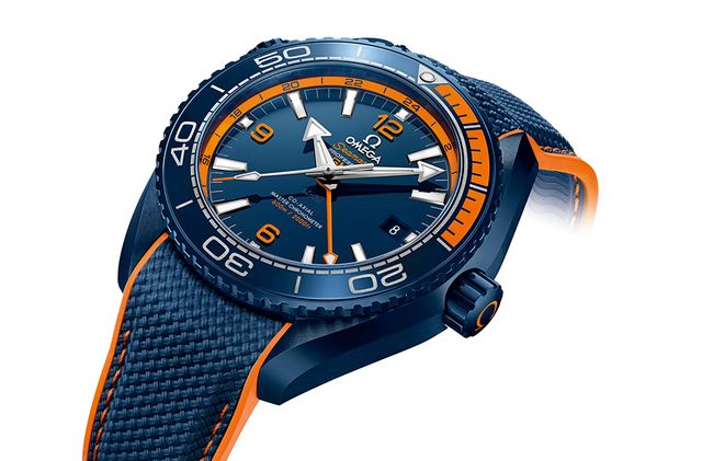
Indeed, patents abound in the world of colour. To create a deep, intensely blue ceramic colour, Omega has developed a special heating treatment, which allowed the company to secure several patents. Surely the next evolution of the colour story will see some technical development to allow the colouring of the bulk of metal used for a watch case – at this stage, it’s not possible, and you’re back to PVD to do something moving in that direction. This isn’t to say some brands aren’t trying though. Omega has achieved distinctive shades by creating exclusive gold alloys, such as Sedna gold and Canopus gold. More recently, Bulgari has developed a patent-pending system of metal plating to give its case a certain hue. To achieve an almost white metal effect – to differentiate it from titanium – the steel base of the new Octo Finissimo Automatic was first plated in gold, then palladium and finally rhodium.
“The idea is to provide another way of seeing the watch by treating what is a common material with a common look in a way that gives a differently coloured result,” explains Bulgari’s director of watch design Fabrizio Buonamassa. “The only way we could find to do that was through plating and finishing – the more it’s finished, the more the colour changes. It’s complicated because you’re dealing with multiple layers of different materials; you keep changing the hardness of the surface you’re working with. But the result is very special. Sometimes you only have to change one detail on a watch – the colour – to get what feels like an entirely new piece. And it’s the kind of thing we’re going to see more and more of.”
