Throughout the course of the year, some watches make an impact right from the off; others enter your world with a little less fanfare, taking their time to win you over. So it was with the Rado Hyperchrome Ultra-Light - I think it was only on seeing it up close for the third time that I really looked at it.
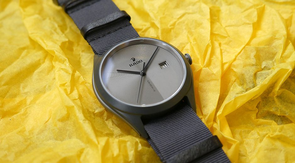
And I liked what I saw. The all-grey design (the watch is made from a single block of solid grey ceramic, with sandblasted titanium caseband inserts in a slightly darker shade of grey) is perhaps one reason why it didn't stand out among the glitz and glamour of Baselworld, but back in London it looked a lot more relevant, surrounded as we are by mid-century modern furniture and deep in a love affair with all things Scandinavian that shows no sign of ending.
This is a very trendy watch in other ways too. It's on a grey textile strap, a decision taken in the name of lightness and barely-there wrist presence, and one I immediately approve of. Rado is forever at pains to remind the world of its place in the narrative of "alternative" materials (which have been around since the 1960s, when Rado produced the original DiaStar), but the brand's all-ceramic bracelets have often left me cold. A little bit shiny, a little bit space-age, and a little bit dated, but not here.
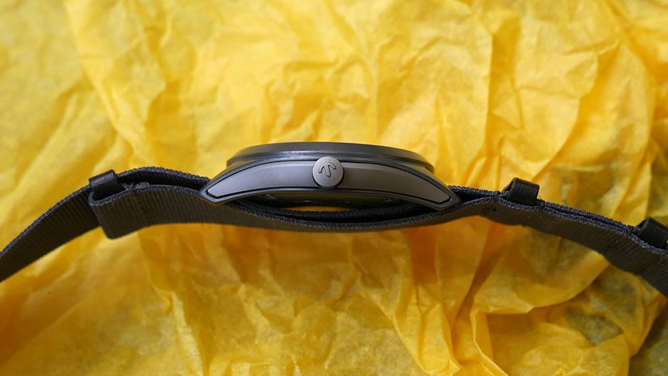
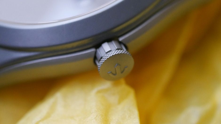
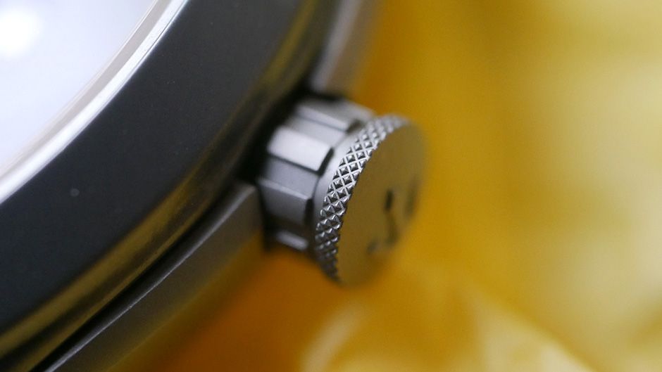
The ceramic of the Ultra-Light's case has a matte finish, the perfect foil for the brushed "Zen garden" effect going on on the dial - more of that in a second. Materials nerds (like us) will note that it's silicon nitride, not the more commonly-used zirconium nitride. That brings even greater weight savings (the watch weighs just 56 grams), and a boost in hardness too. The crown is sandblasted titanium too, and one of my favourite details on a watch that's full of them. Look at the design; just enough knurling to give good grip, and a very slight lip to help pulling it out, but nothing more than it needs. On a streamlined watch such as this, I wouldn't have been surprised if the crown had been insubstantial and fiddly to use - but it's perfect.
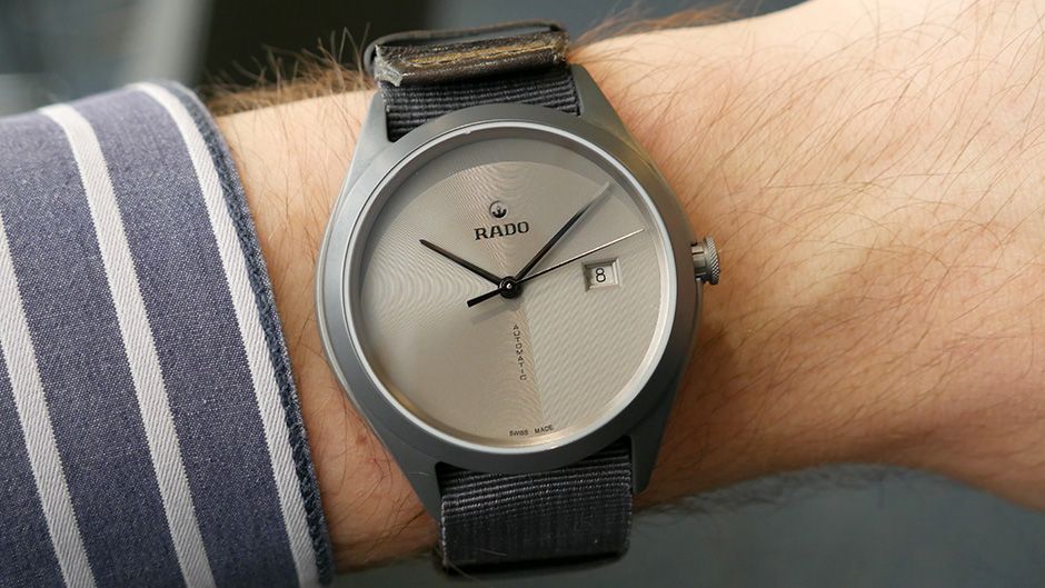
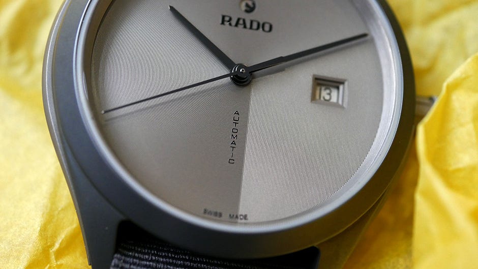
The major design touches are on the dial, where we find this unique radial brushing that mimics the raking of sand in a Buddhist garden, beginning and ending at a sharp vertical line down from the central pinion to the 6 o'clock point. At a glance you might think the watch had a typical sunburst finish, but this is much more interesting. The best bit of all, for me, is the vertical "AUTOMATIC" that follows this line down - it's a sharp, clever, fun way to accommodate dial text and draw attention to the unusual finish. Elsewhere on the dial, the logo is pleasingly modest (I can see logo-creep becoming one of our pet hates of 2017) and with it comes the rotating anchor symbol, a familiar Rado touch (that always puts me in mind of the insignia for the Star Wars Rebel Alliance...).
Of course there is a date window, and if I had to quibble I would say the watch would look easily as good, if not better, without it. But it really isn't one of those date windows that gets under your skin and ends up ruining the whole experience - even though its positioning isn't perfect either. That's down to the ETA-derived calibre beneath, a 11.5 ligne movement that doesn't reach quite as far as the edge of the dial. The watch overall is 43mm across, but wears much smaller thanks to the strap and its frankly ephemeral weight.
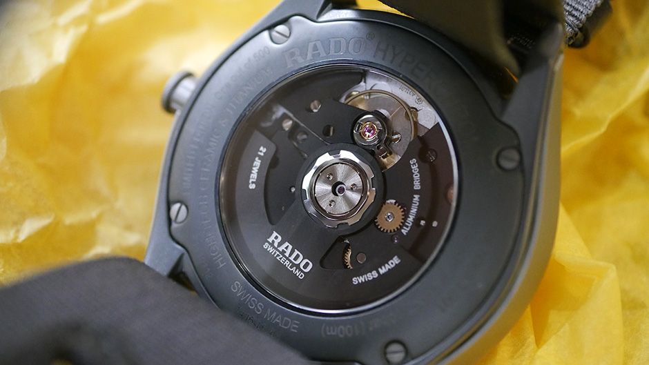
Speaking of the movement, Rado has done a couple of interesting things here too. Well, ok, one interesting thing, which is to use black anodised aluminium on the bridges and rotor. This is necessary, so they tell us, to shave more fractions of a gram off the overall weight, but it also results in a pretty cool looking movement. It's hidden behind that grey Nato strap, usually, but unusually for a watch like this, actually worth pulling that strap up for a peek. I've seen (much) less interesting movements displayed with much more fanfare, so this was a nice surprise.
The watch is a limited edition (one of 500 pieces), and in a way the highest praise I can give it is that I wish it wasn't. It's a real sleeper hit of 2016, and exactly the kind of thing Rado should be doing instead of dallying with tennis players and all that. Something tells me next year we'll see more of this design-led attitude.
The Rado Hyperchrome Ultra-Light retails at £2,350.
